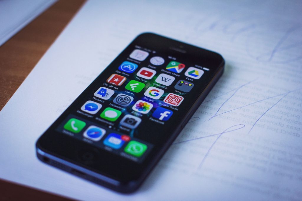
For a lot of businesses, apps have become fundamental when it comes to some aspects. We’re willing to bet a company wouldn’t want to go back to doing things with paper and pen after they’ve experienced the flexibility and functionality of Snappii’s apps. We’ve helped businesses all over the world accomplish all sorts of tasks, even when we’ve had to jump through hoops to do it.
Creating and testing that many apps comes with a sort of responsibility. Not only does Snappii have to make sure it’s apps are all working 100% of the time, we also have to keep an eye on competitors and what they’re doing. We see a lot of apps.
A lot of app builders, even the ones that build for huge corporations, fall into similar mistakes when creating apps. While sometimes disguised as being “intuitive” or “functional”, it’s easy to give software too much. The three reasons here will give you an idea of what I mean by that.
Keep it Simple
People like to make things useful. It’s not necessarily a bad thing, it’s just in our nature to make tools. Specifically tools that we can use to better our day-to-day operations. A carpenter wouldn’t be able to get much done without his hammer.
But, there is a point of excess when it comes to functionality. The app creator should remember the original purpose of the app. Once you’ve started to deviate from that too far, you’re better off making another app.
We once had a customer that wanted to combine a taxi delivery service with a pizza delivery service. He figured since cars were driving around anyways, they would be able to pick up pizza and deliver it in between houses. While it would be great, think about the amount of confusion that could take place in the app? You’re begging for your users to hate you if you make things too complicated, and that goes for any app, business or not.
People enjoy using intuitive products. When the shoe fits, you wear it. When an app works the way you intended, you use it.
On-board properly
If you can’t seem to make the app as intuitive as you want, there’s always the idea of offering a good tutorial at the start of the app.
There’s a couple different styles for this. One style is a series of popups right when you sign into the app for the first time. They give a brief overview and provide pictures of possible things a user might see in the app.
Another idea is to slowly introduce new concepts and ways to use the app as the user explores it for the first time. This can be done in the form of notification bubbles, messages, and more.
Be tasteful with your advertisements
You don’t have to accept and publish every single advertisement that offers your channel some money. Picking advertisements that resonate with your business could go a long way in receiving funds for ads.
Using Snappii’s platform, one can build and customize an app from scratch to suit their personal business’s needs. If you would like to submit a custom request, please email support@snappii.com. You can also try out the Snappii Labs by clicking here.

 Login
Login

